Francesco Paolo Macchiarella

Full Stack Developer | Product case studies

A curated overview of full-stack products, dashboards, integrations, and operational platforms built across hospitality, vehicle management, discovery products, and diving operations.

fpmacchiarella@icloud.comLinkedIn profilePalermo, Sicily, ItalyWeb apps, dashboards, product systems

End-to-end product architecture from interface to database

Operational platforms with bookings, payments, roles, and admin tools

Real product screens for dashboards, discovery flows, support workflows, and business control

Selected Case Studies

Hospitality platform

Face B&B

2025 - Present

Challenge: Create a complete accommodation platform where hosts can publish, manage, promote, and monitor listings with a more human experience than classic OTA flows.

Delivery: Built search, filters, listing pages, host onboarding, subscription plans, media upload, calendar management, admin governance, multilingual support, wishlists, tracking, and GDPR-aware reporting.

Outcome: A scalable product ecosystem with clear growth loops, stronger listing control, and a conversion path ready for both hosts and travelers.
ReactNext.jsTailwindShadcn UIPostgreSQLPrisma
Landing
Face B&B Landing screenshot
Product screen 1Public

What it shows: Admin overview with KPI cards, tasks, requests, payment state and listing management areas.

Why I built it this way: I kept operational signals grouped on one screen so a host/admin can understand what needs attention before opening deeper flows.

Scope: Dashboard structure, status cards, pending actions, property controls and admin-side visibility.
Search
Face B&B Search screenshot
Product screen 2Filters

What it shows: Long property-editing form with structured fields, amenities, pricing sections and media/listing configuration.

Why I built it this way: I separated data into predictable blocks because accommodation publishing has many required details and operators need confidence before going live.

Scope: Host onboarding, listing setup, form validation, amenities, pricing metadata and content management.
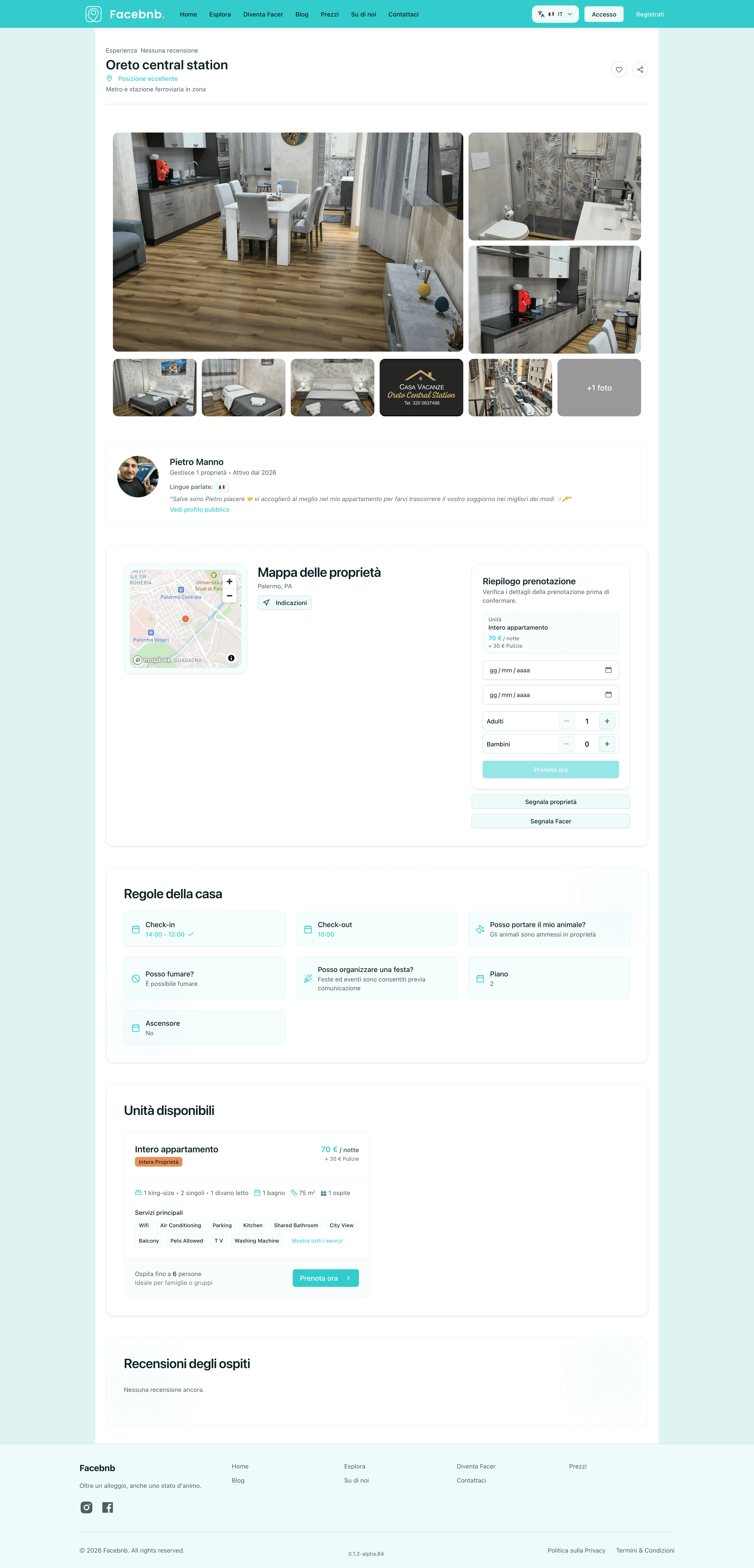
Listing
Face B&B Listing screenshot
Product screen 3Host

What it shows: Public listing page with gallery, host profile, booking panel, location map, services and reviews.

Why I built it this way: I designed it to answer trust questions in order: what the place looks like, who hosts it, where it is, what is included and what others say.

Scope: Listing detail page, booking intent, image gallery, host trust layer, map and review presentation.
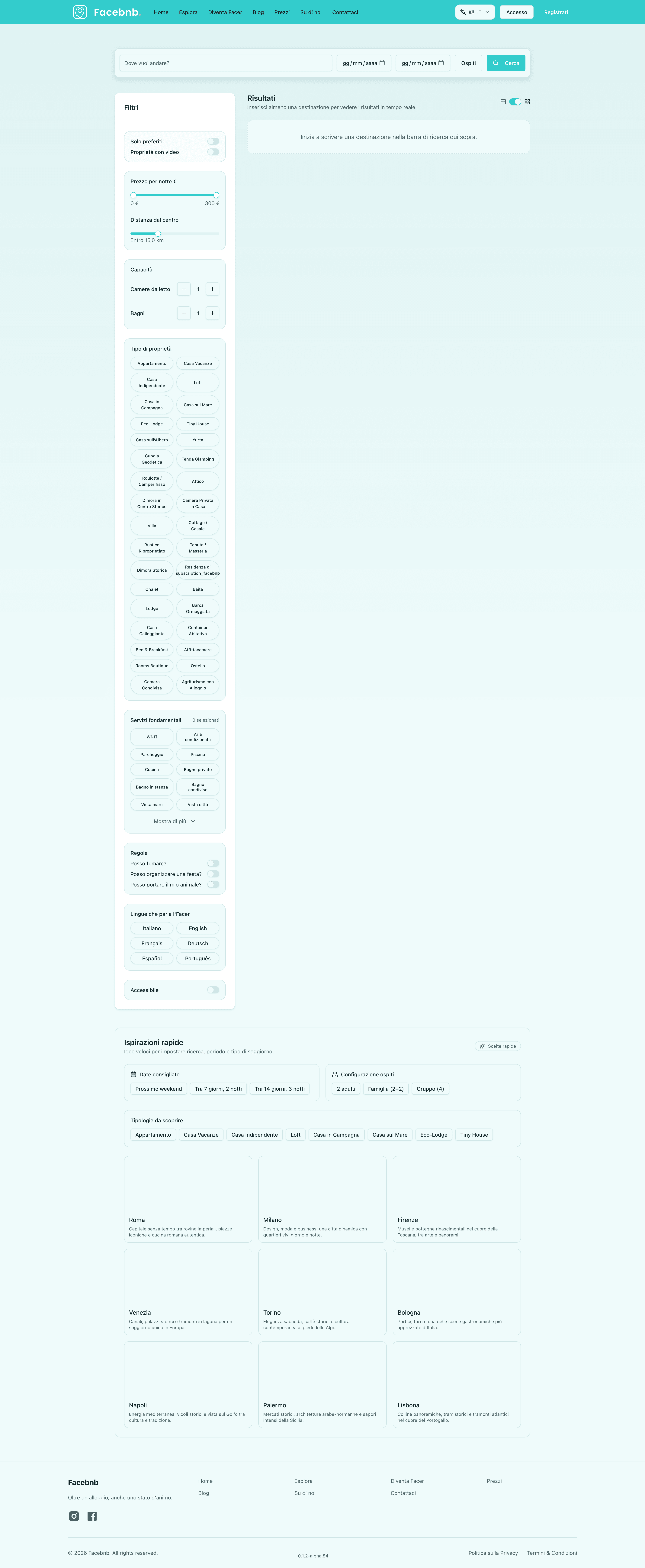
Details
Face B&B Details screenshot
Product screen 4Booking

What it shows: Search/filter experience with a vertical filter rail, detailed constraints and result area.

Why I built it this way: I made filters persistent because travel discovery depends on quick comparison without losing the current result context.

Scope: Advanced search, filter taxonomy, result refinement, location and accommodation metadata.
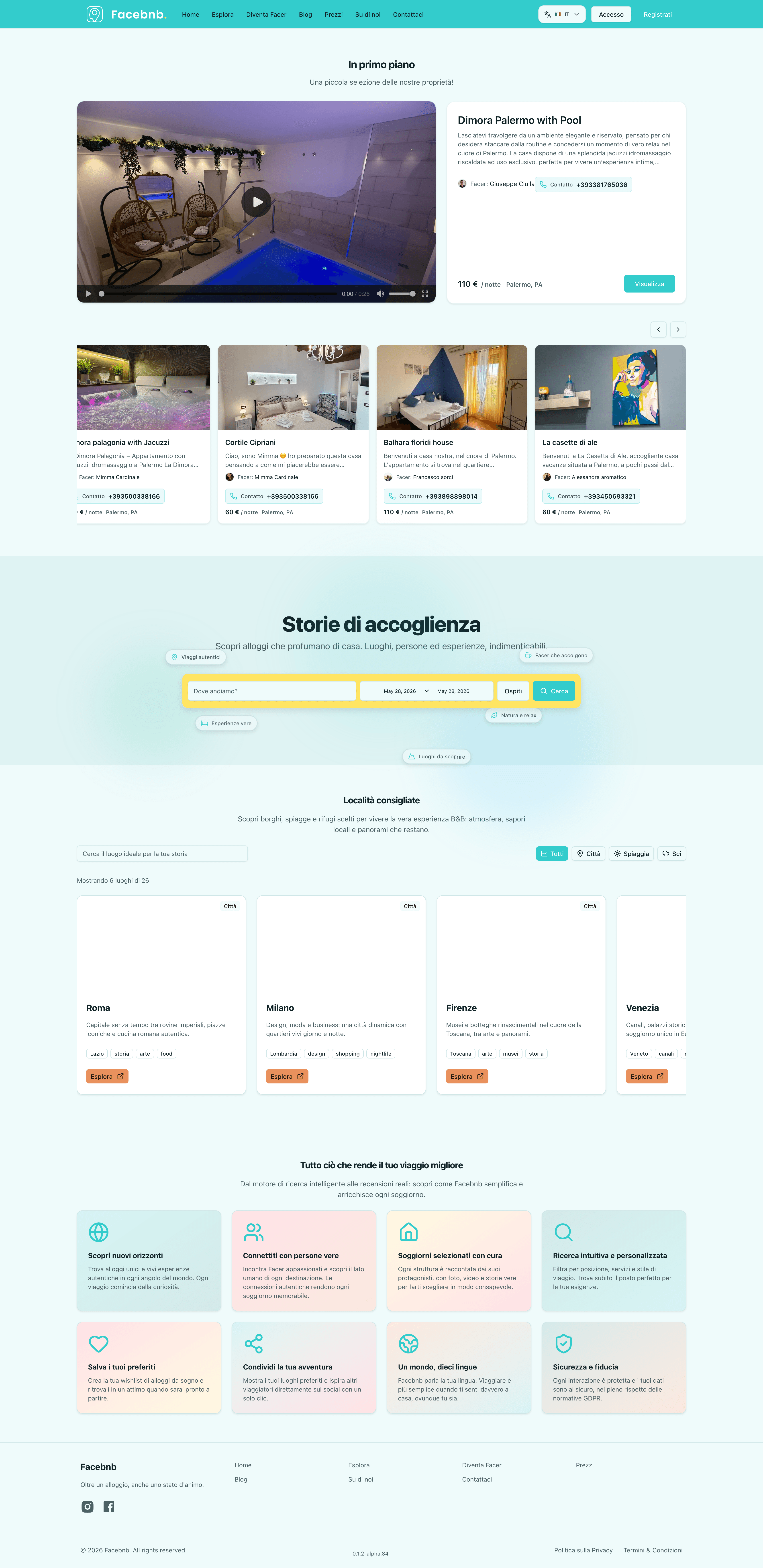
Admin
Face B&B Admin screenshot
Product screen 5Badges

What it shows: Marketing/home flow with hero, property cards, hosting story, discovery sections and trust blocks.

Why I built it this way: I used an editorial structure to make the product feel warmer than a standard OTA while still keeping clear conversion points.

Scope: Landing page, featured listings, storytelling sections, host acquisition and credibility blocks.
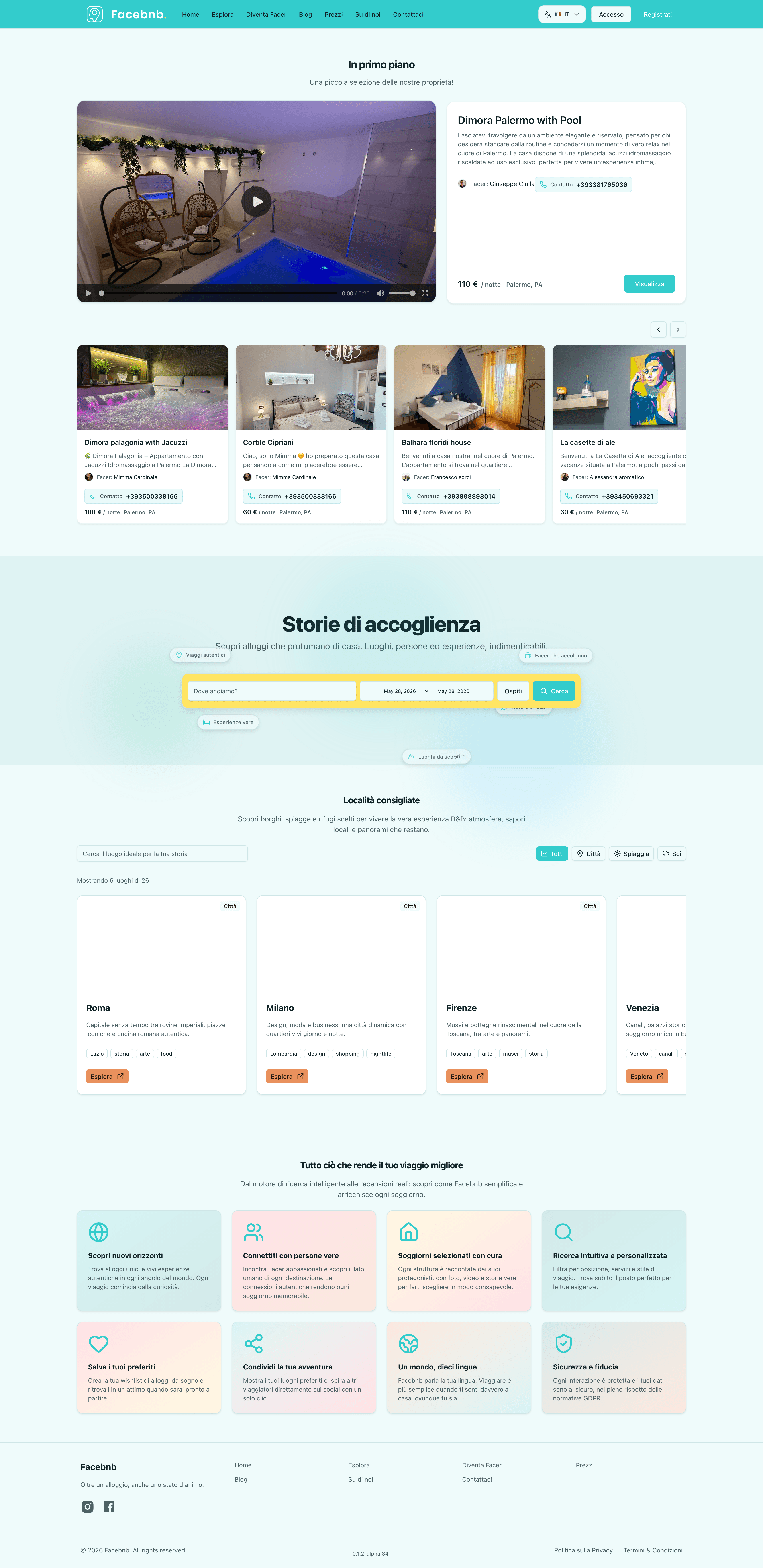
Flow
Face B&B Flow screenshot
Product screen 6Growth

What it shows: Alternative landing state focused on destination discovery, property cards and repeated conversion sections.

Why I built it this way: I repeated the core CTA pattern across the page to keep discovery and host acquisition visible even after scrolling.

Scope: Growth-oriented landing layout, listing previews, CTA rhythm, trust and discovery content.
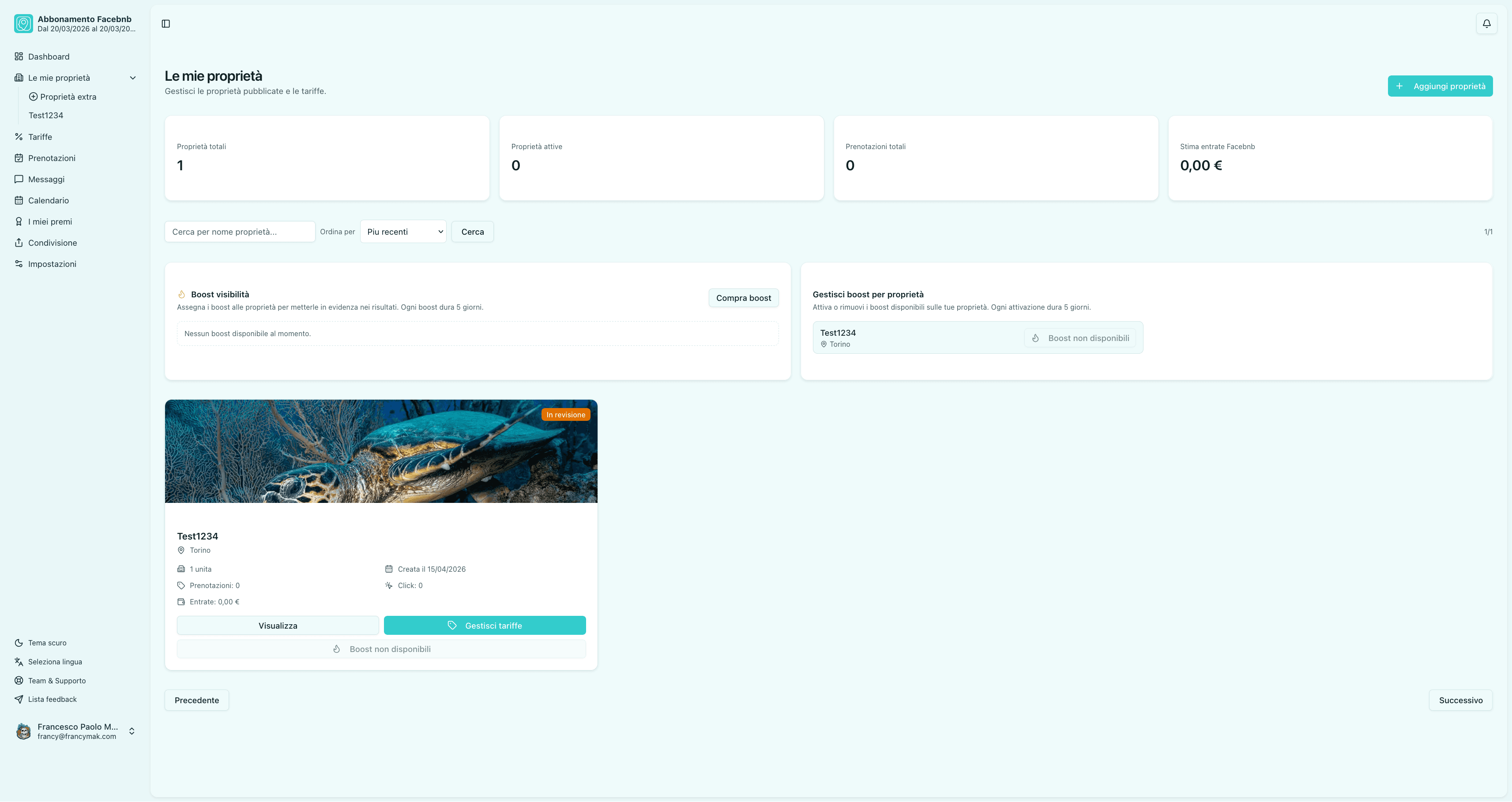
My Properties
Face B&B My Properties screenshot
Product screen 7Host

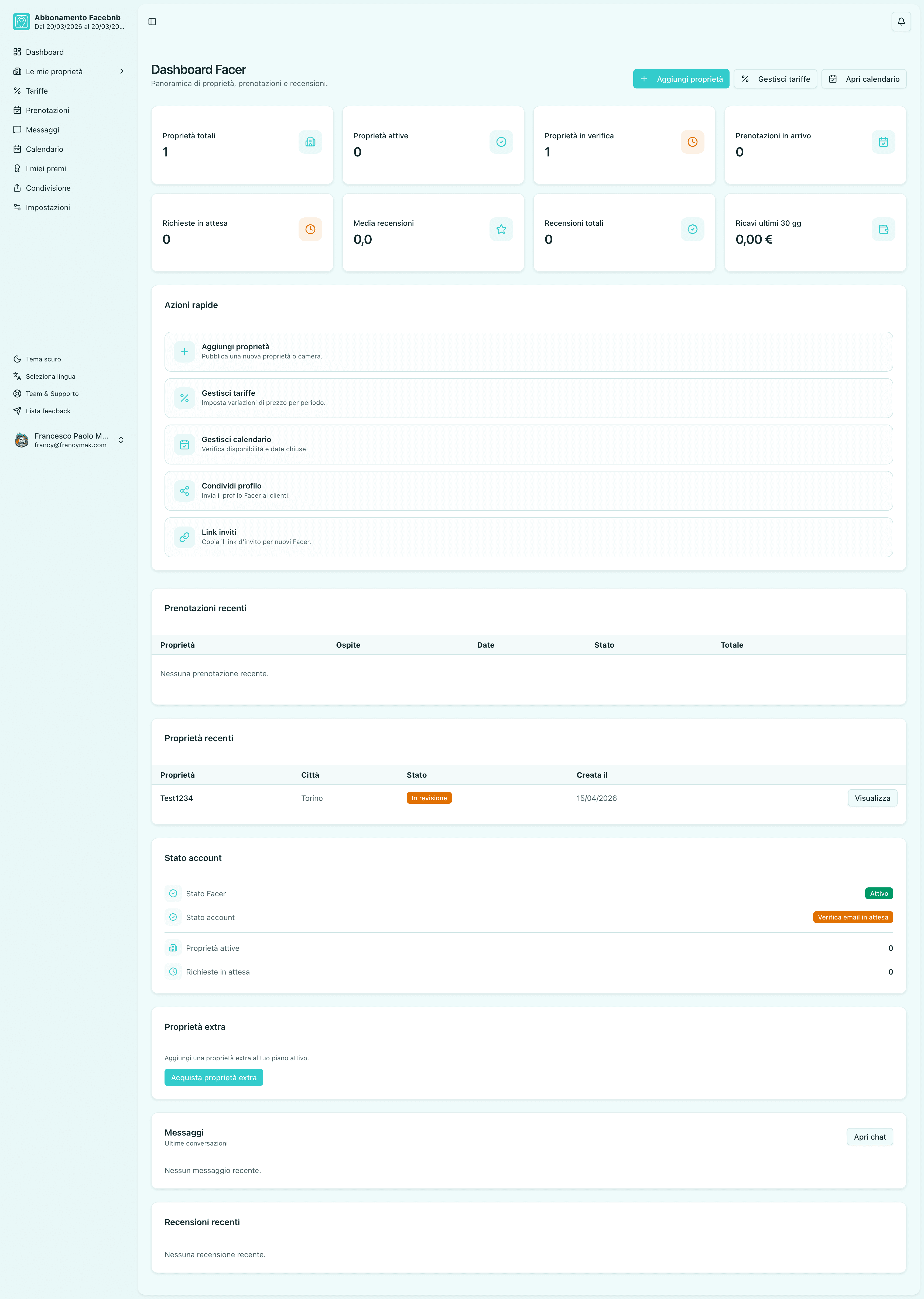
What it shows: Host property-management screen with KPI cards, payment/action blocks and a property card.

Why I built it this way: I kept the active property visible in the same workspace as the operational counters so hosts can understand listing state quickly.

Scope: Host dashboard, property card, listing status, payment action, promotion flow and admin navigation.
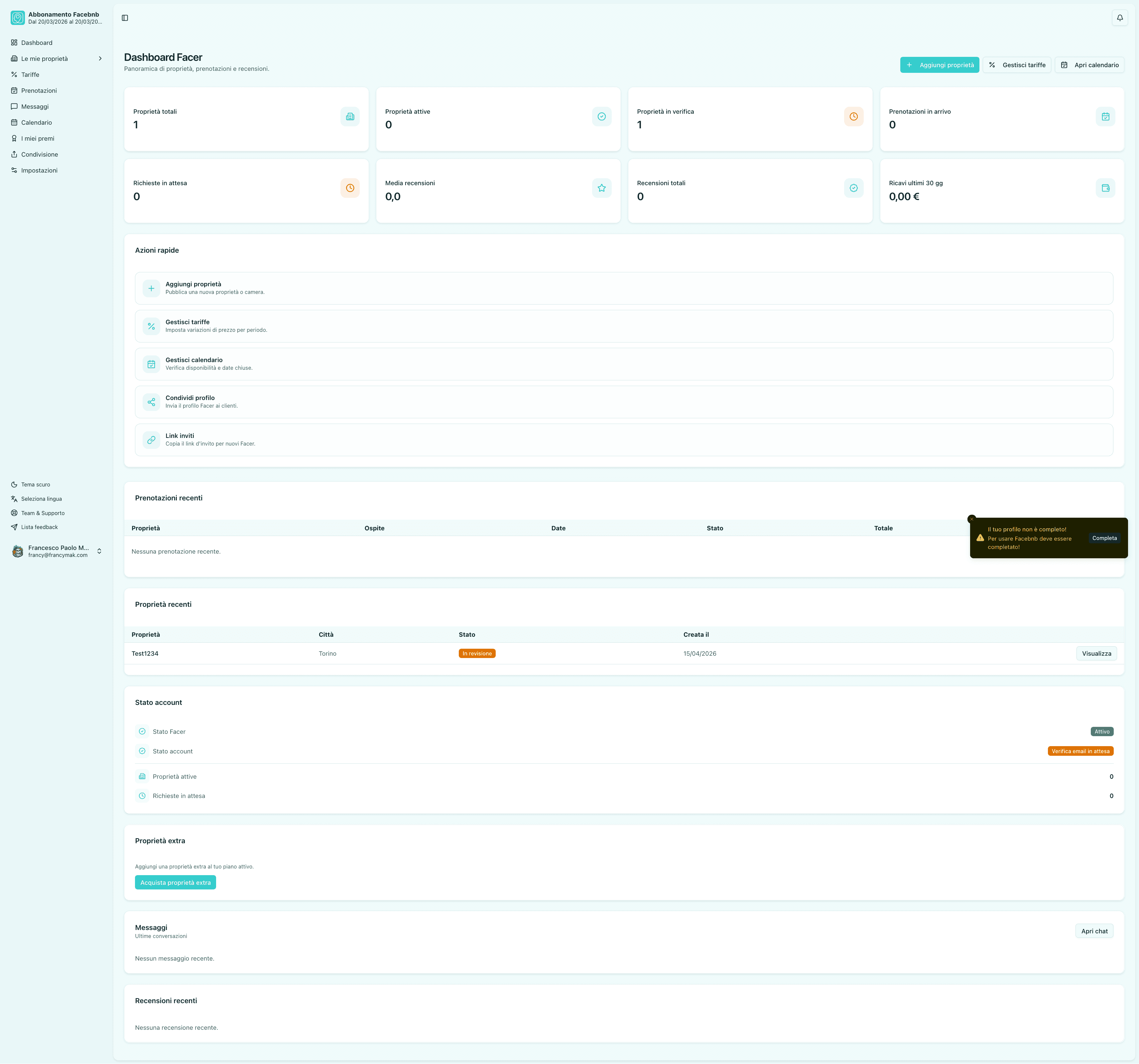
Admin Overview
Face B&B Admin Overview screenshot
Product screen 8Ops

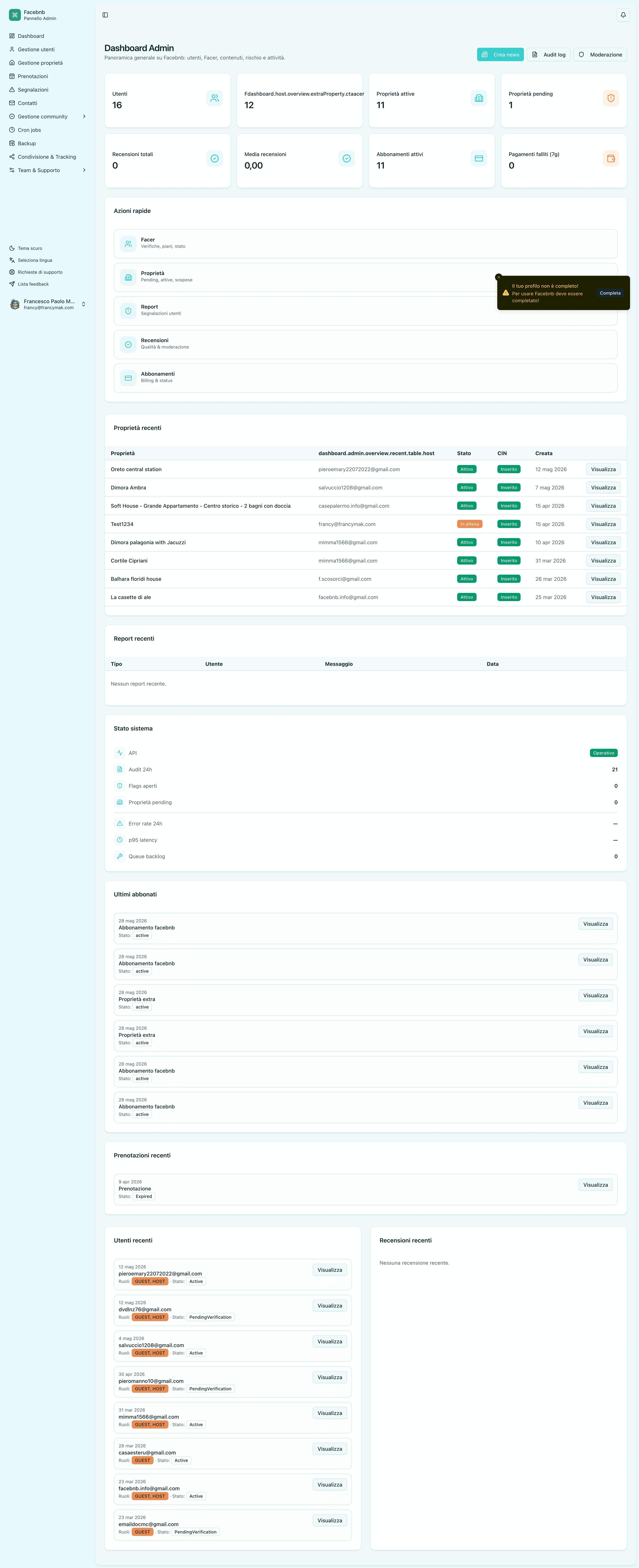
What it shows: Light-theme Face B&B admin dashboard with KPI cards, pending actions, payment blocks and task sections.

Why I built it this way: I used a light administrative layout to make long operational pages calmer and easier to scan during daily host management.

Scope: Admin overview, task routing, property operations, payment signals and status monitoring.
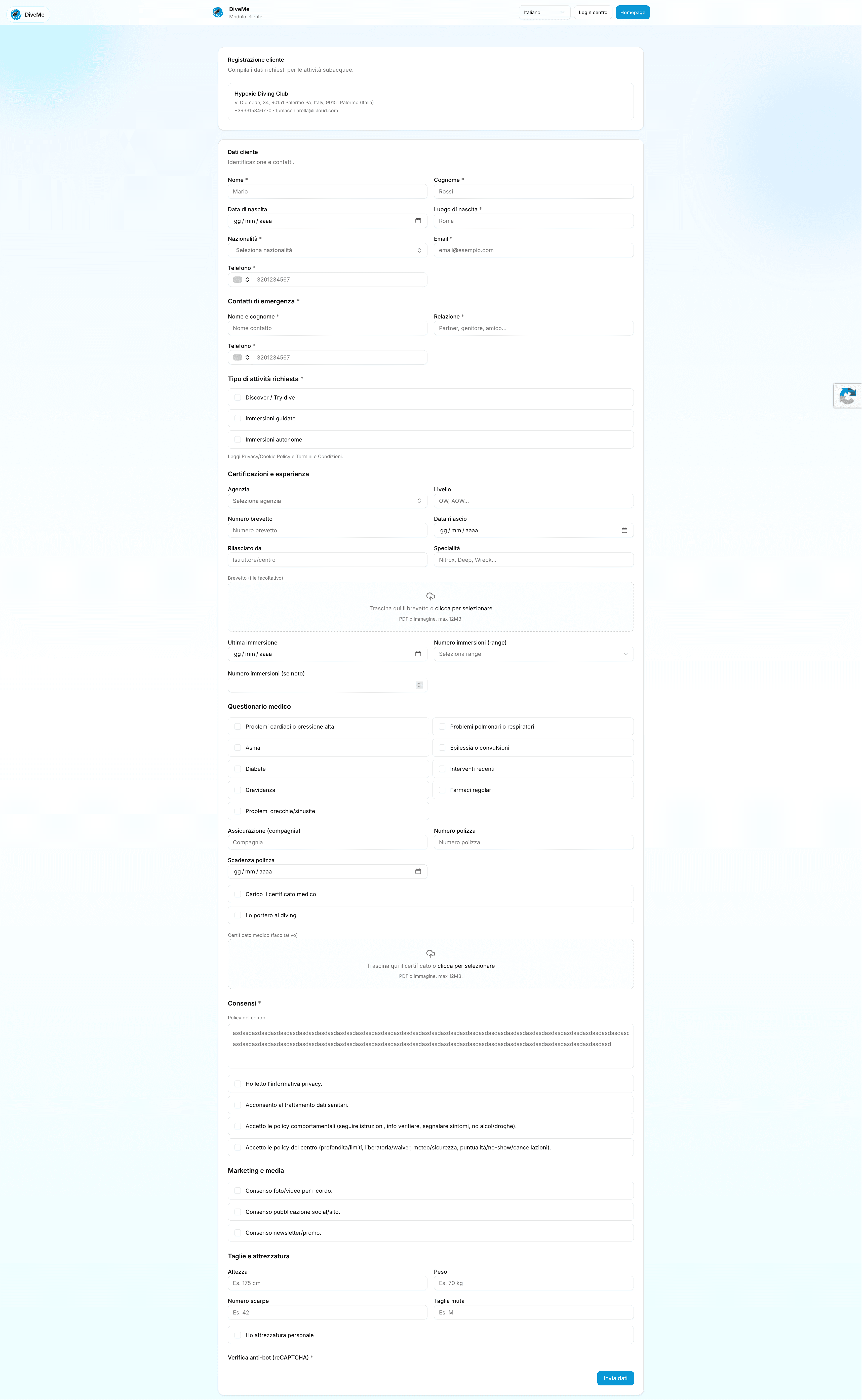
Customer Form
Face B&B Customer Form screenshot
Product screen 9Booking

What it shows: Light customer-facing booking/request form with long structured personal, stay and consent sections.

Why I built it this way: I used a clean light layout because external users need readability, trust and clear section separation when completing long forms.

Scope: Customer intake, booking request details, consent data, checkout information and public form completion.
Vehicle management platform

MakkVMS

2025

Challenge: Create a structured operational interface for managing vehicle-related data, controls, dashboards, and administrative workflows.

Delivery: Designed dense dashboard screens, table-heavy management views, operational forms, status cards, and navigation patterns for repeated daily use.

Outcome: A more organized management experience with clearer data scanning, faster operational control, and a visual system suitable for internal business workflows.

Next.jsReactTypeScriptTailwind CSSDashboard UXAdmin workflows
Private product screens
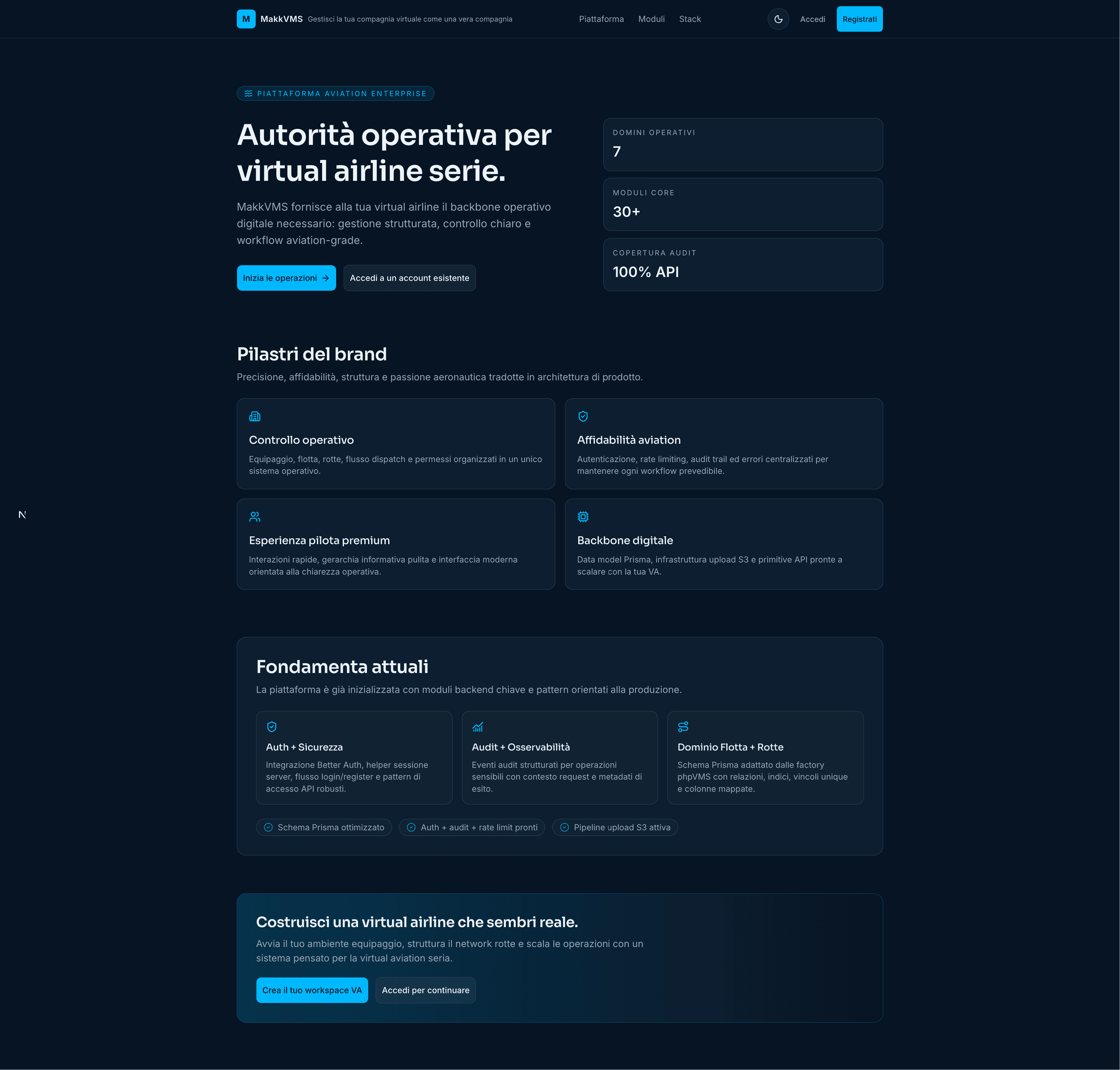
Overview
MakkVMS Overview screenshot
Product screen 1Ops

What it shows: Public positioning page presenting the platform as an authority layer for virtual airlines.

Why I built it this way: I opened with value, proof cards and current foundations to explain the product before asking users to sign in or create a virtual company.

Scope: Marketing entry, product positioning, feature pillars, onboarding CTA and trust framing.

Dashboard
MakkVMS Dashboard screenshot
Product screen 2Fleet

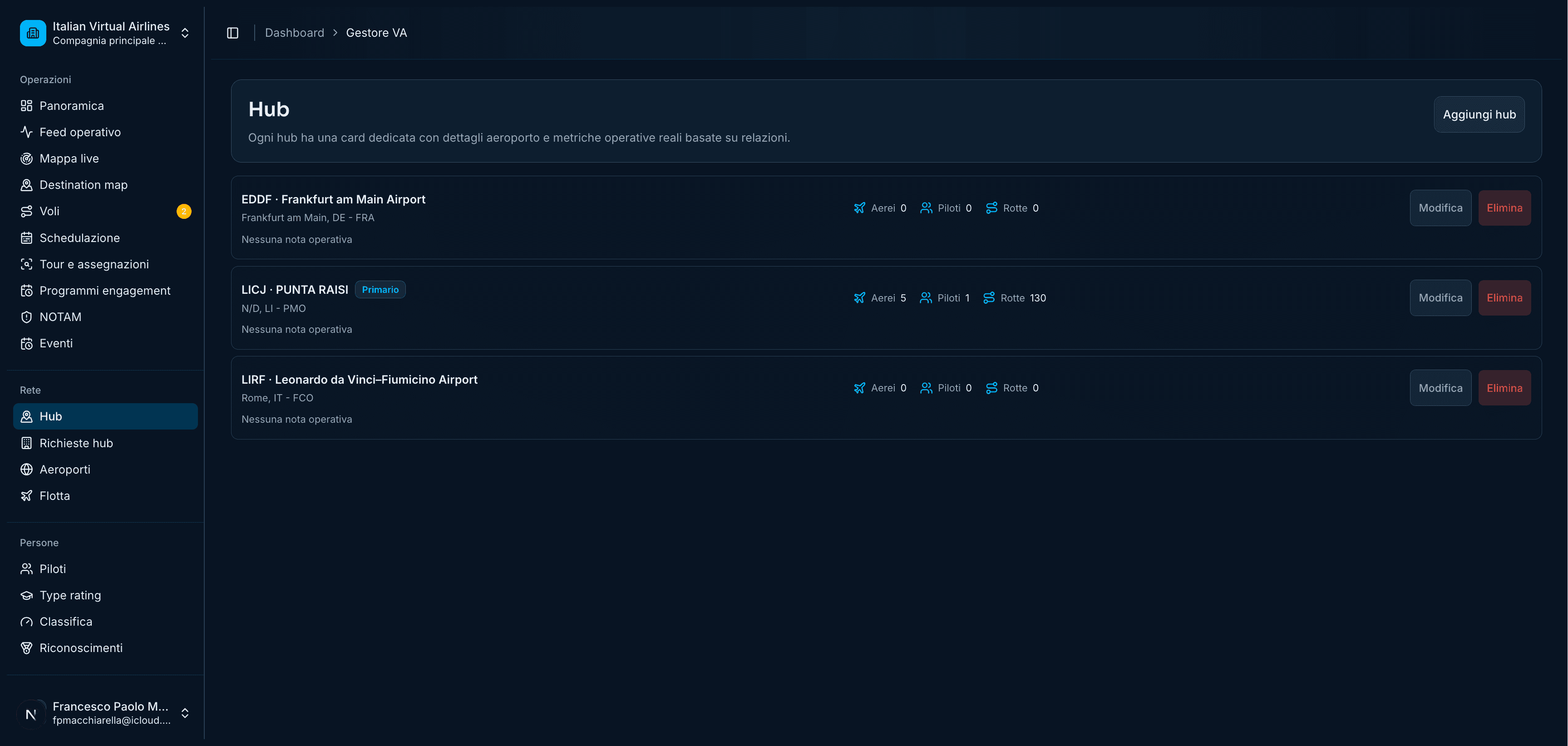
What it shows: Hub management screen listing airports/bases with quick actions for edit and removal.

Why I built it this way: I used a compact table-list pattern because fleet or hub administration needs fast scanning and low-friction maintenance.

Scope: Hub CRUD, airport metadata, admin navigation, action controls and internal management.

Records
MakkVMS Records screenshot
Product screen 3Data

What it shows: Engagement-program dashboard with active programs, campaign focus and reward history.

Why I built it this way: I grouped activity, rewards and program state to make incentive systems measurable instead of hidden in separate pages.

Scope: Engagement programs, campaign tracking, rewards history, admin performance review.

Detail
MakkVMS Detail screenshot
Product screen 4Manage

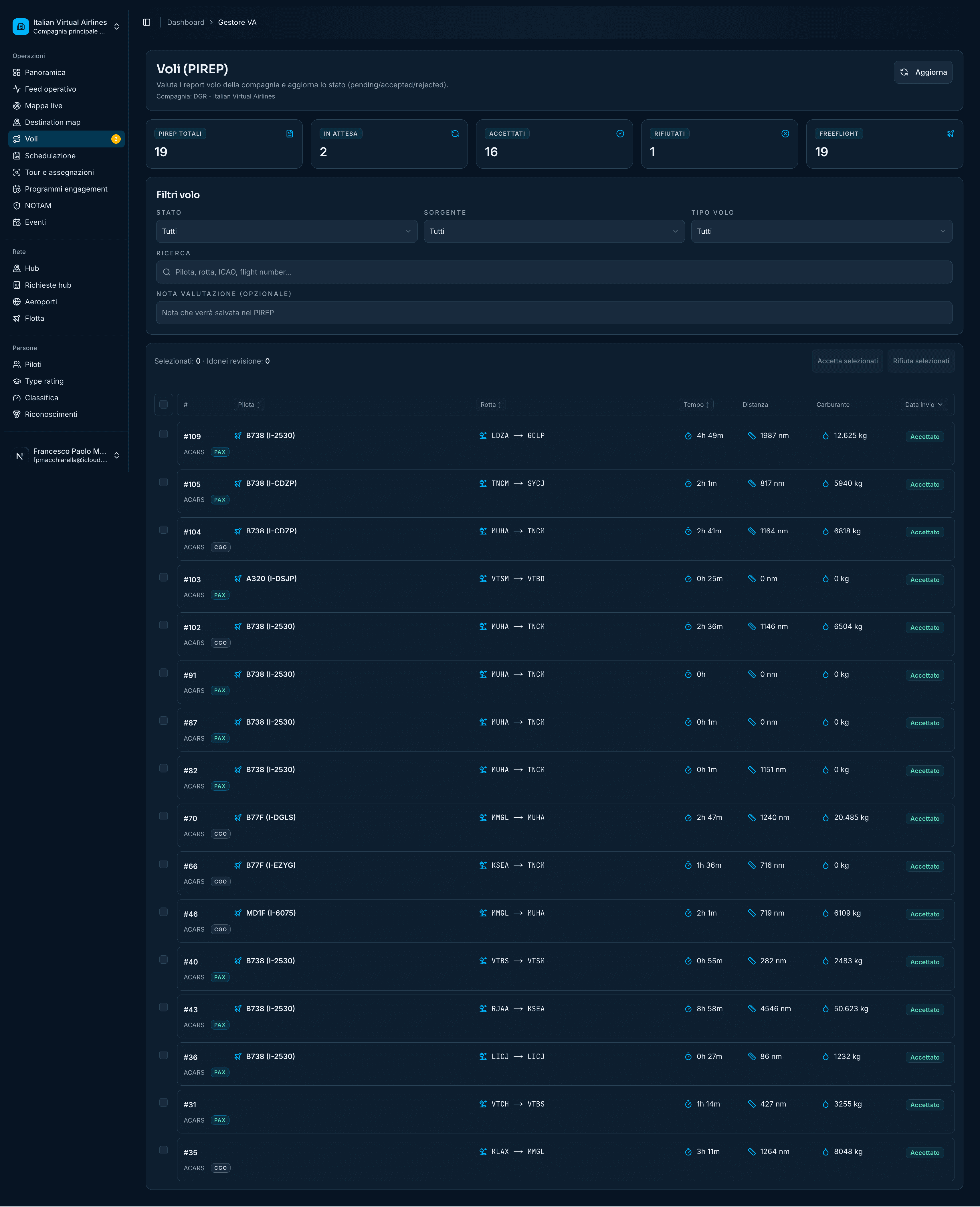
What it shows: Flight/program list with filters, status chips and dense operational rows.

Why I built it this way: I prioritized data density because this type of admin surface is used repeatedly by operators who need comparison more than decoration.

Scope: Filtering, tabular operations, route/status management and repeat-use admin workflows.

Tables
MakkVMS Tables screenshot
Product screen 5Admin

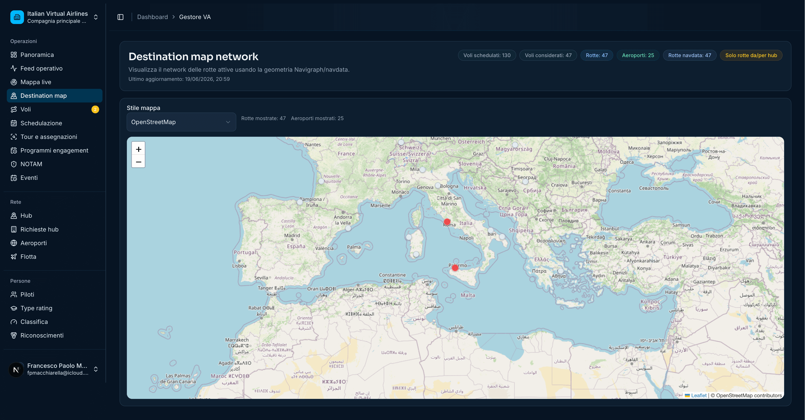
What it shows: Map-based destination network view showing geographic distribution of active points.

Why I built it this way: I used a map because route networks are spatial; operators can understand coverage faster than reading a long table.

Scope: Destination network, geographic visualization, route planning context and map integration.

Forms
MakkVMS Forms screenshot
Product screen 6Input

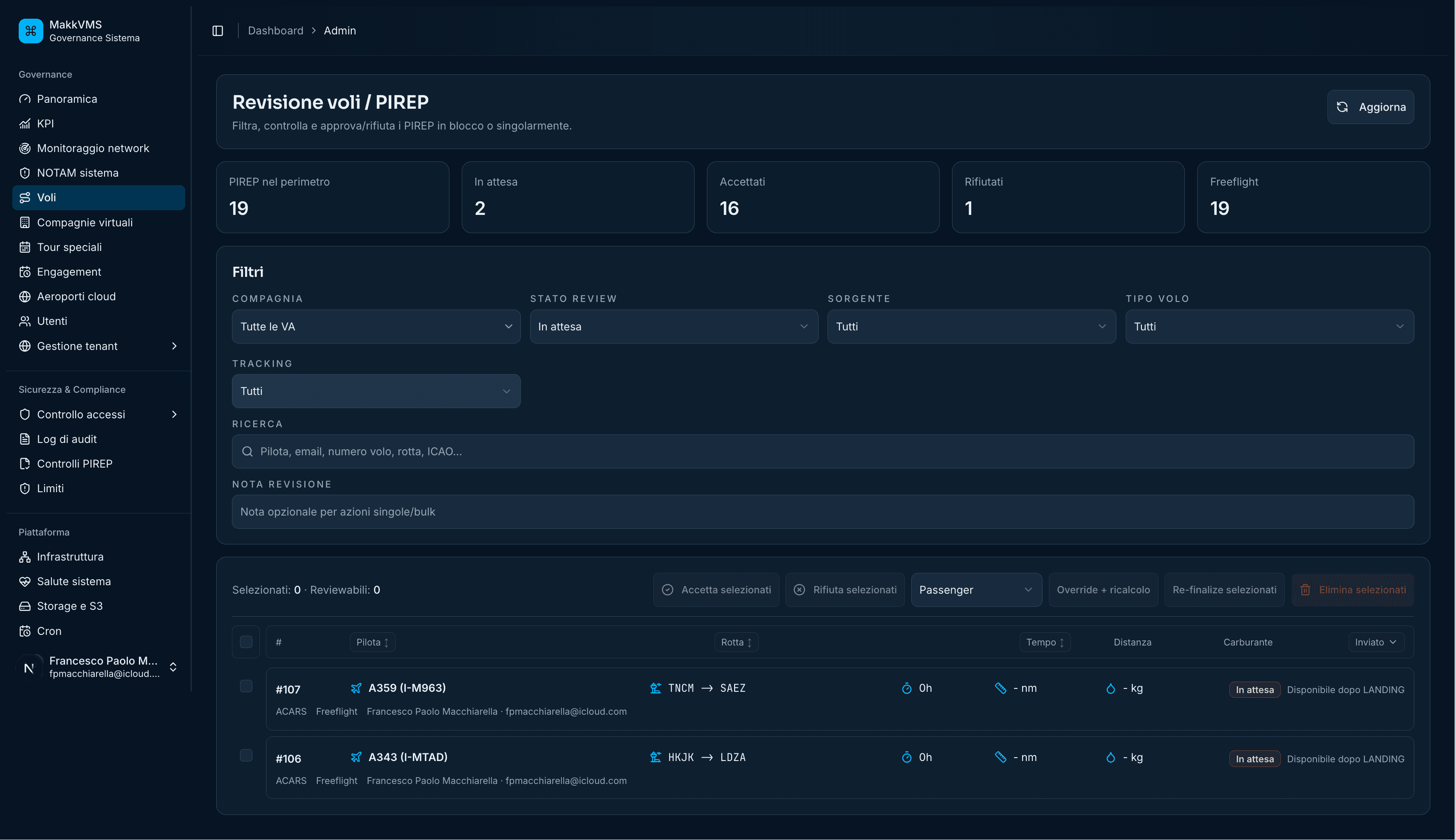
What it shows: PIREP/revision interface with counters, filters, review form and rows of submitted reports.

Why I built it this way: I made the review state visible at the top so moderators can assess workload before handling individual submissions.

Scope: Report review, status filtering, moderation workflow, operator notes and approval decisions.

Reports
MakkVMS Reports screenshot
Product screen 7Track

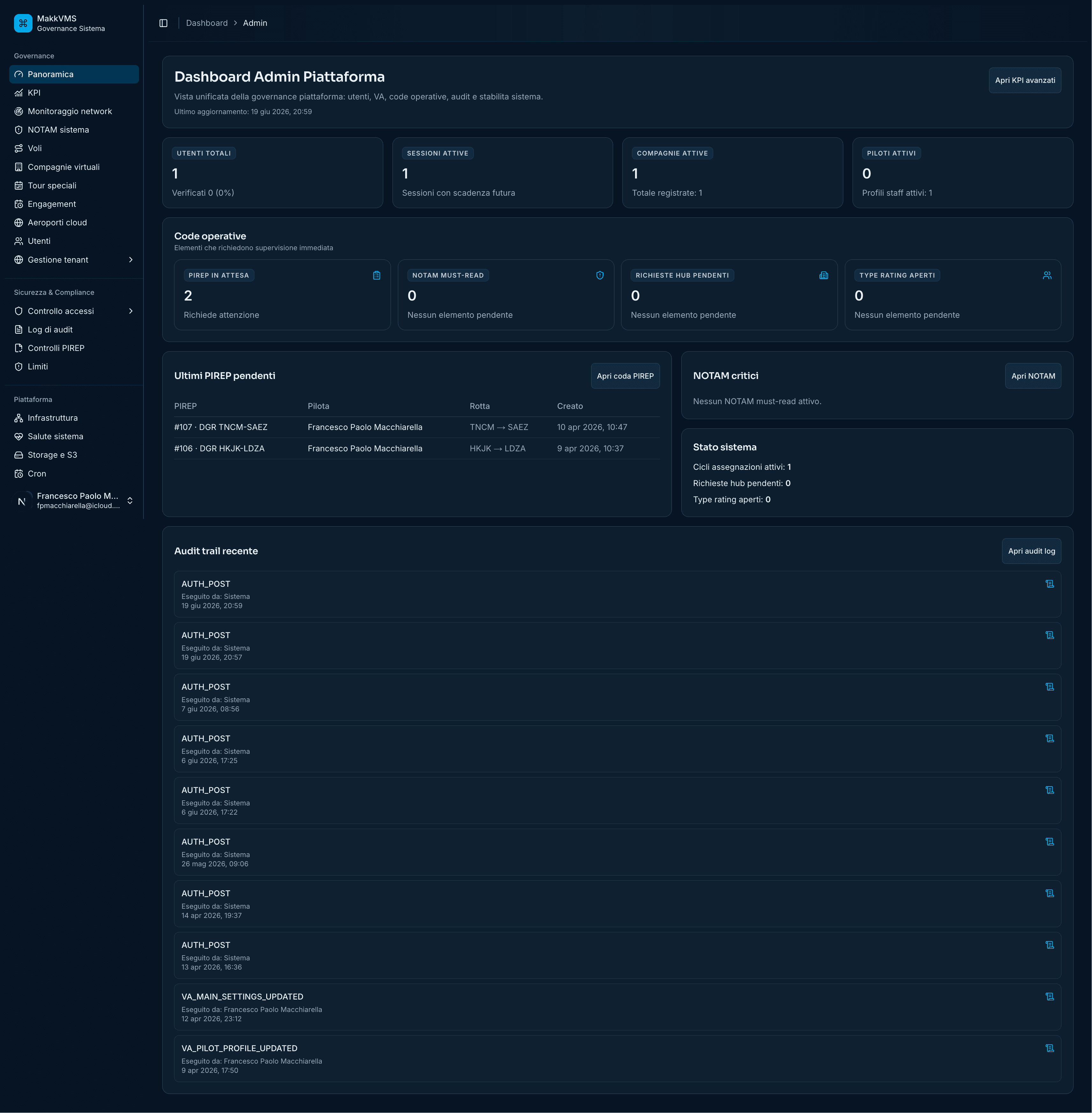
What it shows: Admin platform dashboard with KPI cards, airline list, activity feed and operational summaries.

Why I built it this way: I combined metrics and recent activity so administrators can monitor health and detect issues without opening every module.

Scope: Global admin dashboard, platform KPIs, activity monitoring, airline management and audit overview.

Control
MakkVMS Control screenshot
Product screen 8Status

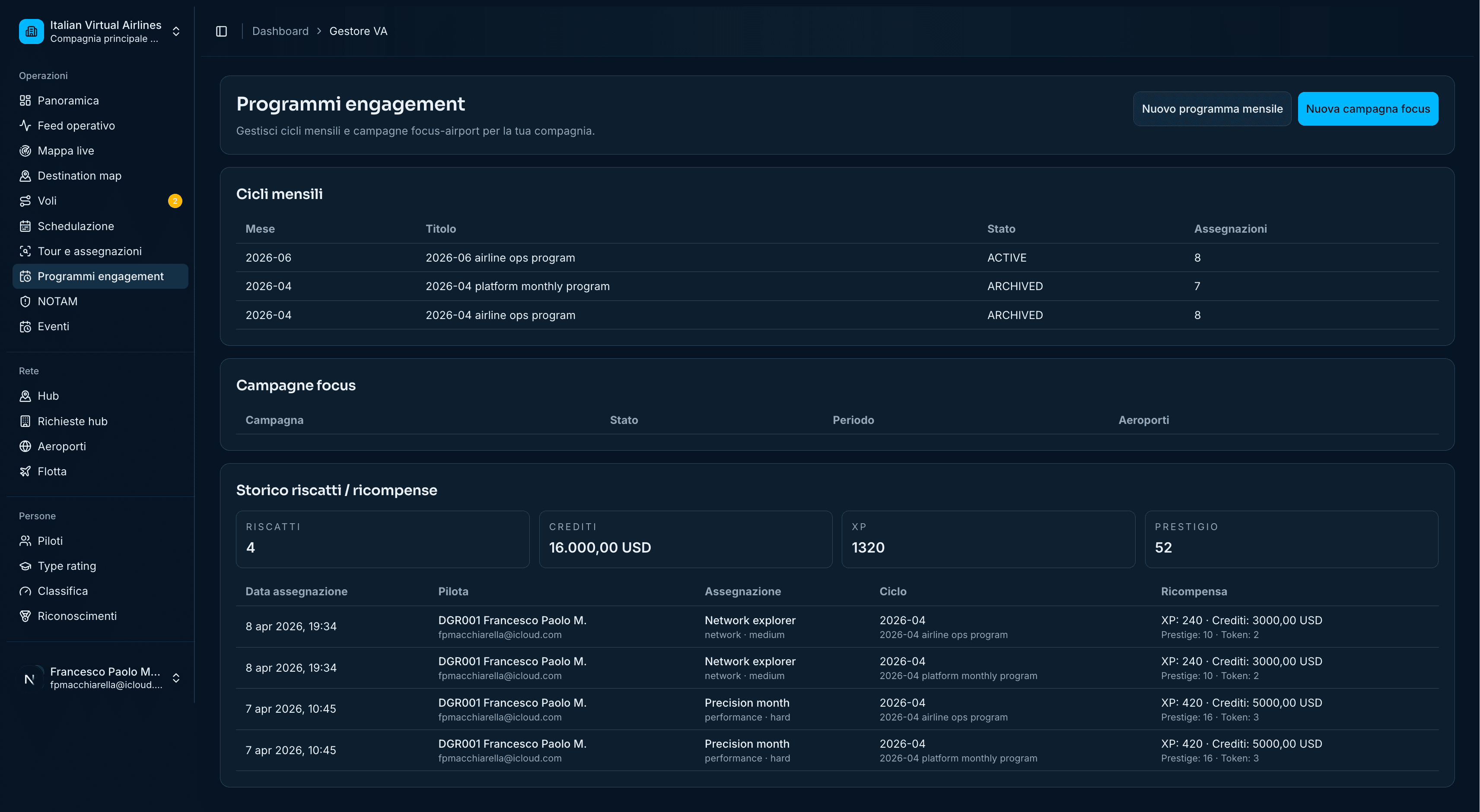
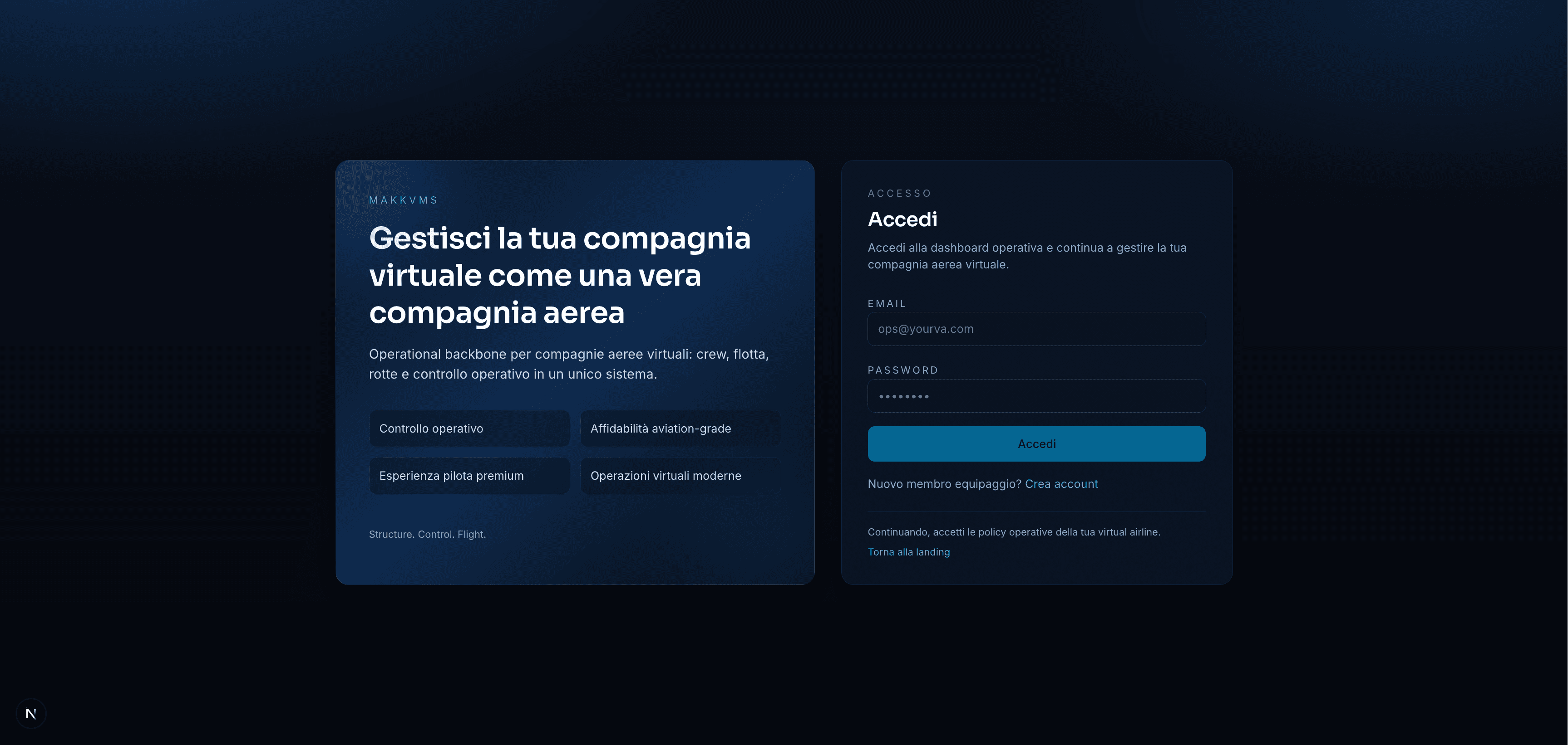
What it shows: Login screen with product explanation and focused authentication panel.

Why I built it this way: I split message and form so new users understand the platform context while returning users can authenticate quickly.

Scope: Authentication, first impression, product copy, access control and session entry.

Operations Dashboard
MakkVMS Operations Dashboard screenshot
Product screen 9Monitor

What it shows: Dark operational dashboard with summary counters, table sections and right-side monitoring widgets.

Why I built it this way: I arranged secondary widgets on the side so the main operational table remains the primary work area while context stays visible.

Scope: Operations dashboard, tabular workflows, monitoring widgets, status metrics and repeated admin actions.

Discovery and matching platform

Experifind

2025

Challenge: Design a product experience that helps users discover, compare, and evaluate opportunities through clear cards, filters, and guided detail views.

Delivery: Built responsive discovery screens, listing layouts, profile/detail pages, and conversion-oriented sections with a polished product feel.

Outcome: A more usable discovery flow where users can scan options quickly, inspect details, and move through the product without losing context.

ReactNext.jsTypeScriptTailwind CSSProduct UXResponsive UI
Private product screens
Home
Experifind Home screenshot
Product screen 1Discover

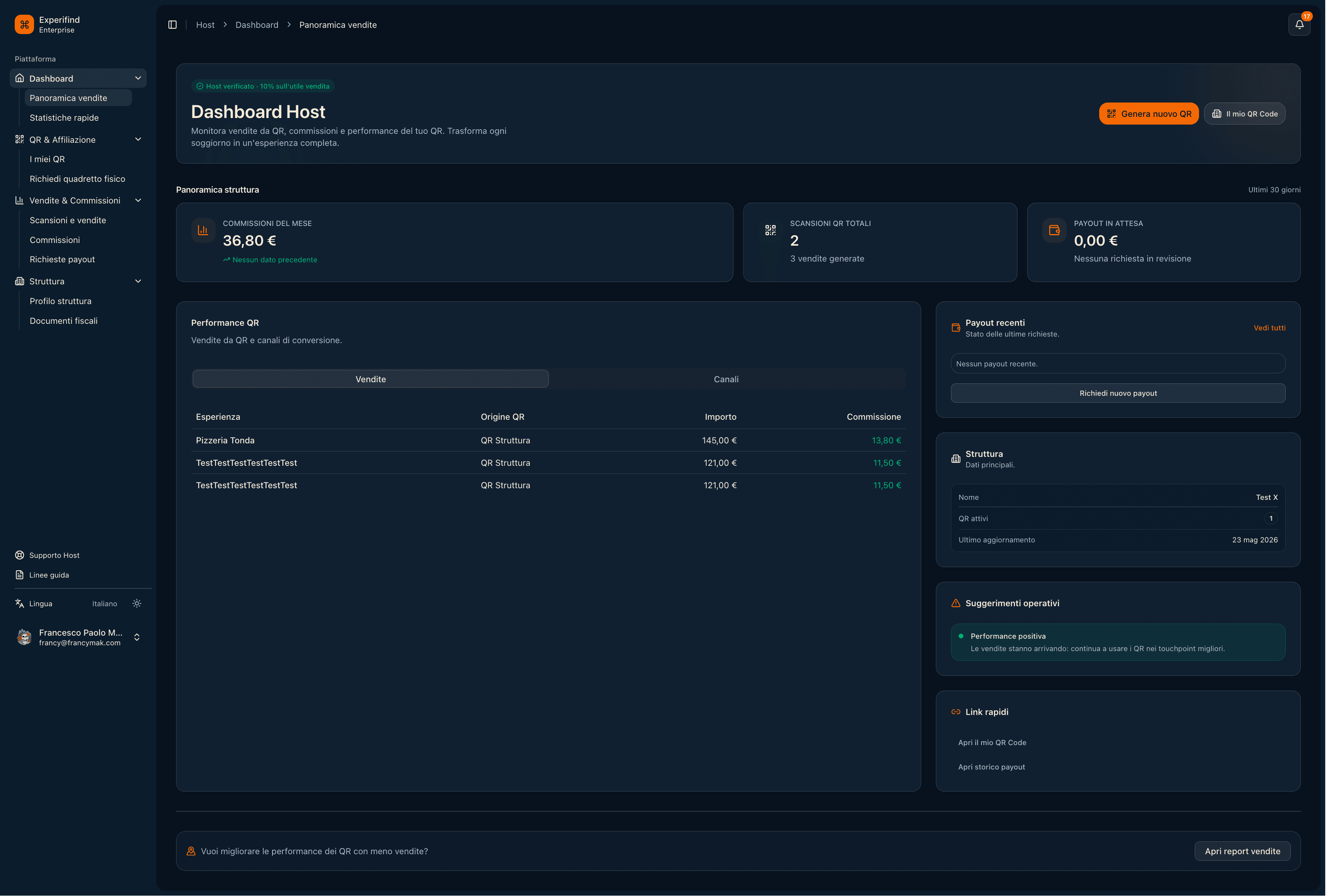
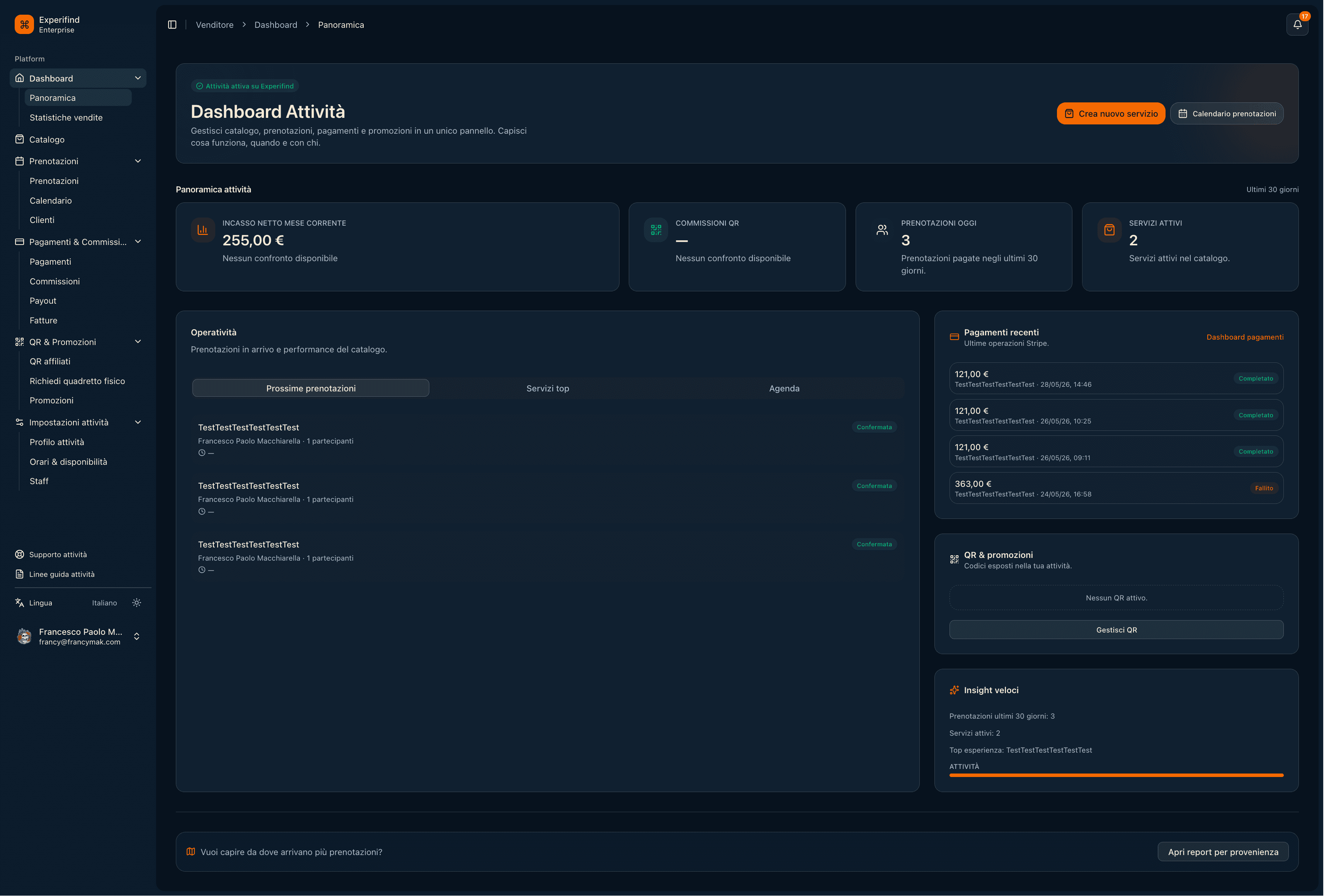
What it shows: Host dashboard with performance cards, reservation table, quick widgets and payment-related summaries.

Why I built it this way: I used a dashboard-first entry because operators need immediate status and revenue context before managing individual listings.

Scope: Host dashboard, revenue overview, reservation summary, quick actions and account context.

Flow
Experifind Flow screenshot
Product screen 2Convert

What it shows: Activity dashboard with revenue, reservation counters, recent items and task widgets.

Why I built it this way: I placed financial and operational activity together because conversion-oriented products need both business and workflow visibility.

Scope: Activity tracking, revenue summary, recent reservations, task widgets and host operations.

Mobile
Experifind Mobile screenshot
Product screen 3UX

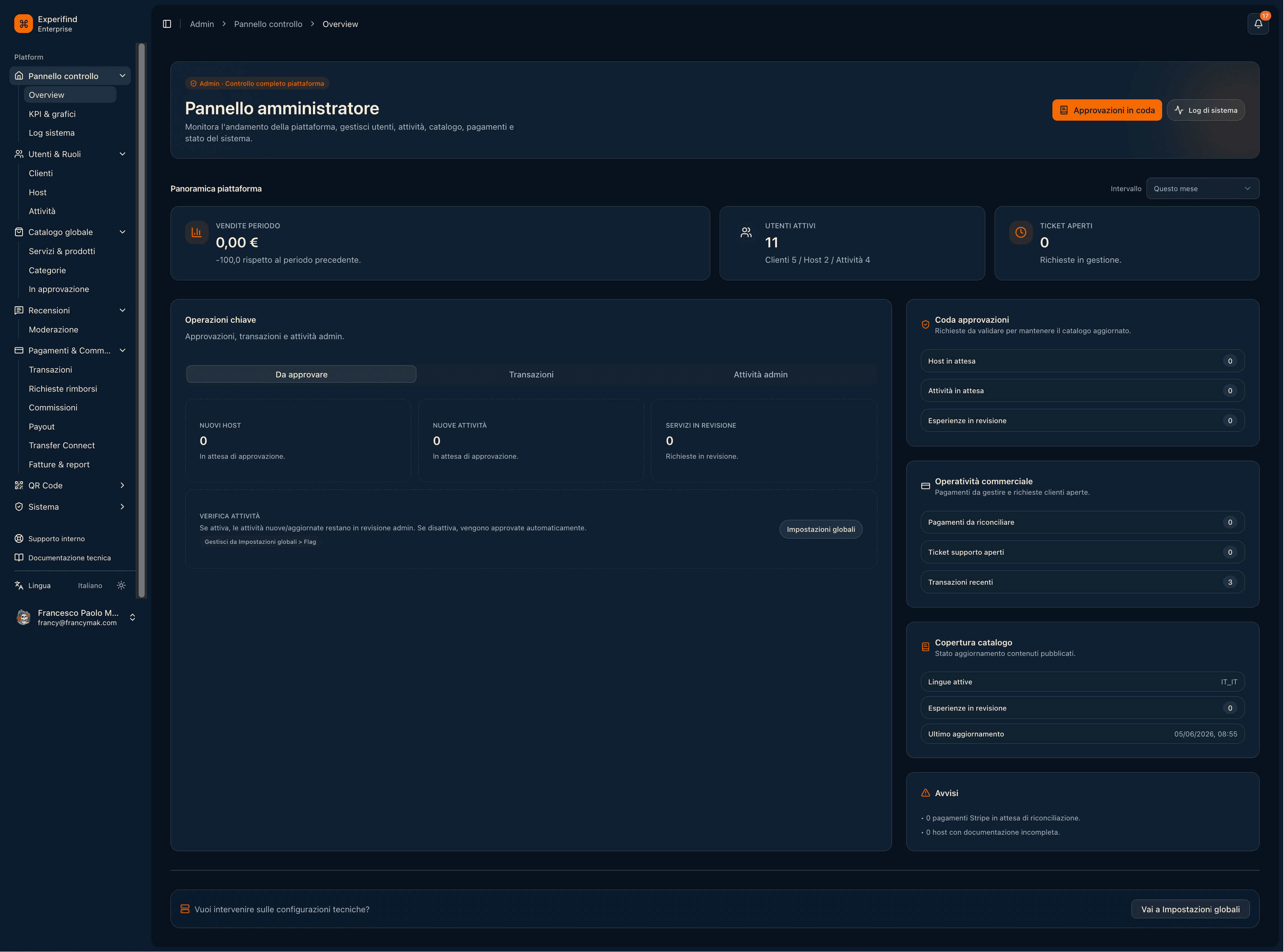
What it shows: Administrator panel with platform-level cards, trend/summary area and stacked management modules.

Why I built it this way: I made the layout modular so platform owners can add or remove management blocks without redesigning the whole dashboard.

Scope: Admin platform overview, modular panels, performance summaries, system tasks and management extensibility.

Diving center management

DiveME

2024 - Present

Challenge: Unify customers, bookings, courses, rentals, subscriptions, payments, and staff workflows for diving centers.

Delivery: Built customer profiles, checkout history, booking modules, Stripe billing, real-time notifications, role-based dashboards, mobile-ready screens, and GDPR-conscious data handling.

Outcome: Centers can reduce manual coordination, manage daily operations from one product surface, and keep payment-linked workflows more reliable.

Next.jsReactReact NativeNode.js APIsPostgreSQLPrismaStripe
Dashboard
DiveME Dashboard screenshot
Product screen 1Ops

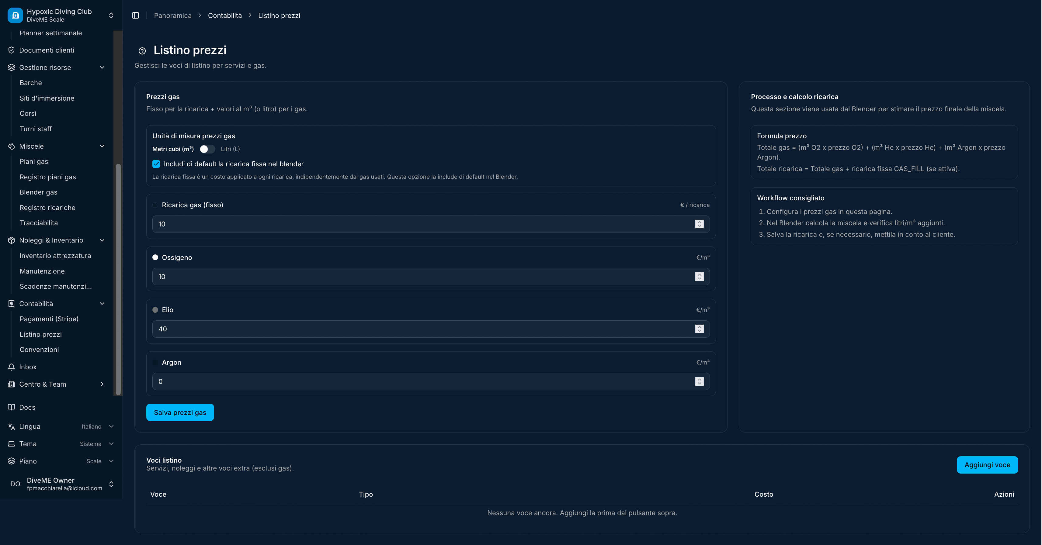
What it shows: Price-list creation form with grouped fields for items, categories and pricing rules.

Why I built it this way: I made the form linear and explicit because diving centers need fewer ambiguous steps when configuring paid services.

Scope: Pricing setup, service catalog, form validation, price rules and operational configuration.

Bookings
DiveME Bookings screenshot
Product screen 2Stripe

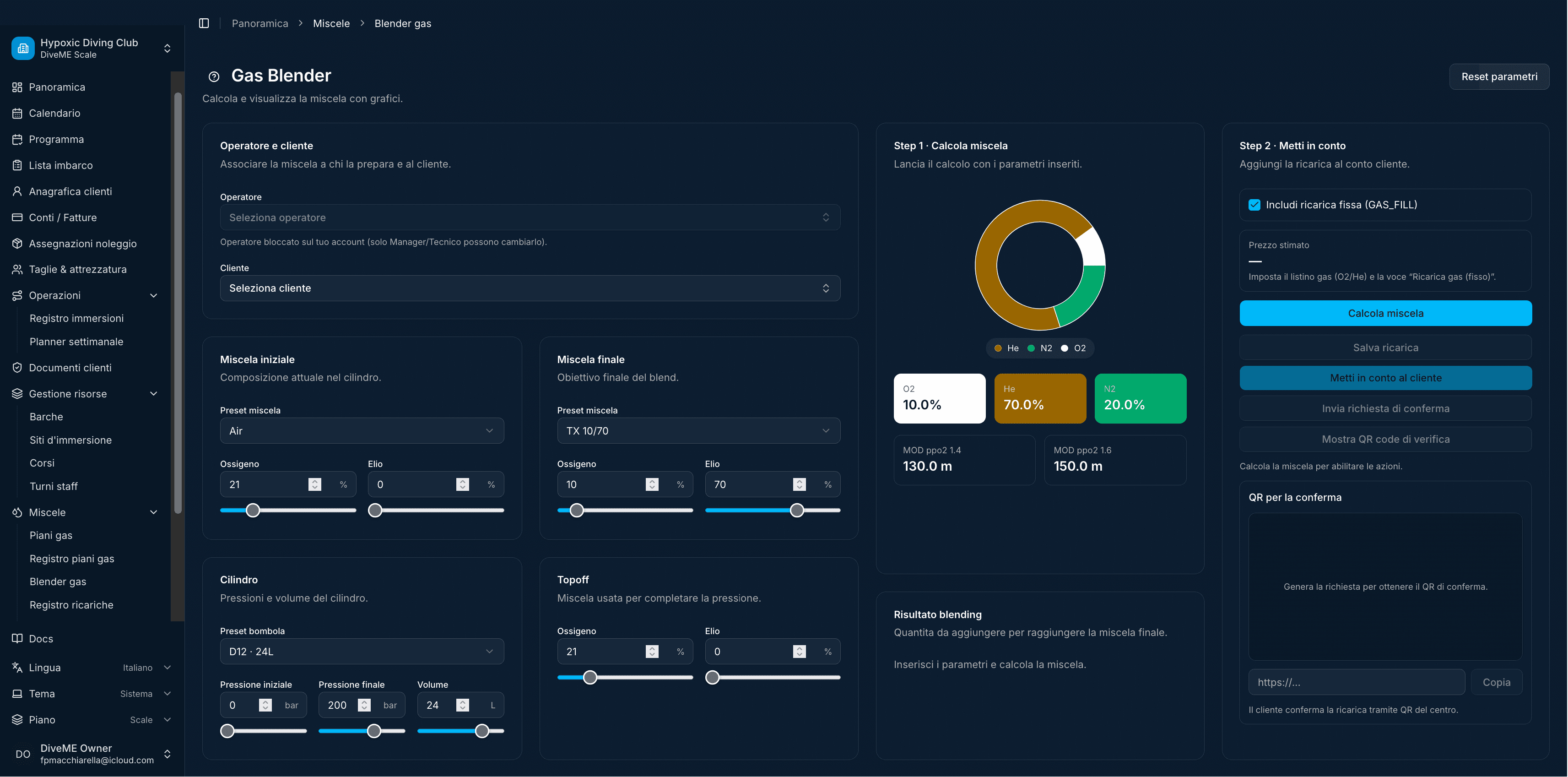
What it shows: Gas-cylinder blend calculator with sliders, target values, cost panels and final mix summary.

Why I built it this way: I used interactive controls and immediate totals because blend planning is numeric and benefits from quick iteration.

Scope: Gas blending, calculator UX, pricing estimation, operational parameters and assisted decision-making.

Calendar
DiveME Calendar screenshot
Product screen 3Plan

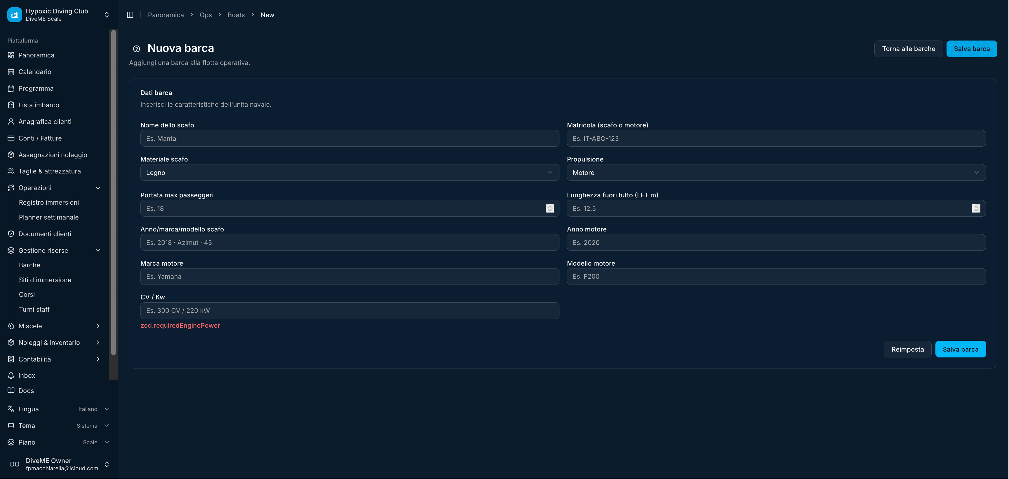
What it shows: New boat form with technical fields, capacity values and operational metadata.

Why I built it this way: I kept the data entry compact because staff should be able to register operational assets without leaving the admin flow.

Scope: Boat management, asset registration, technical metadata, capacity fields and admin forms.

Customers
DiveME Customers screenshot
Product screen 4Roles

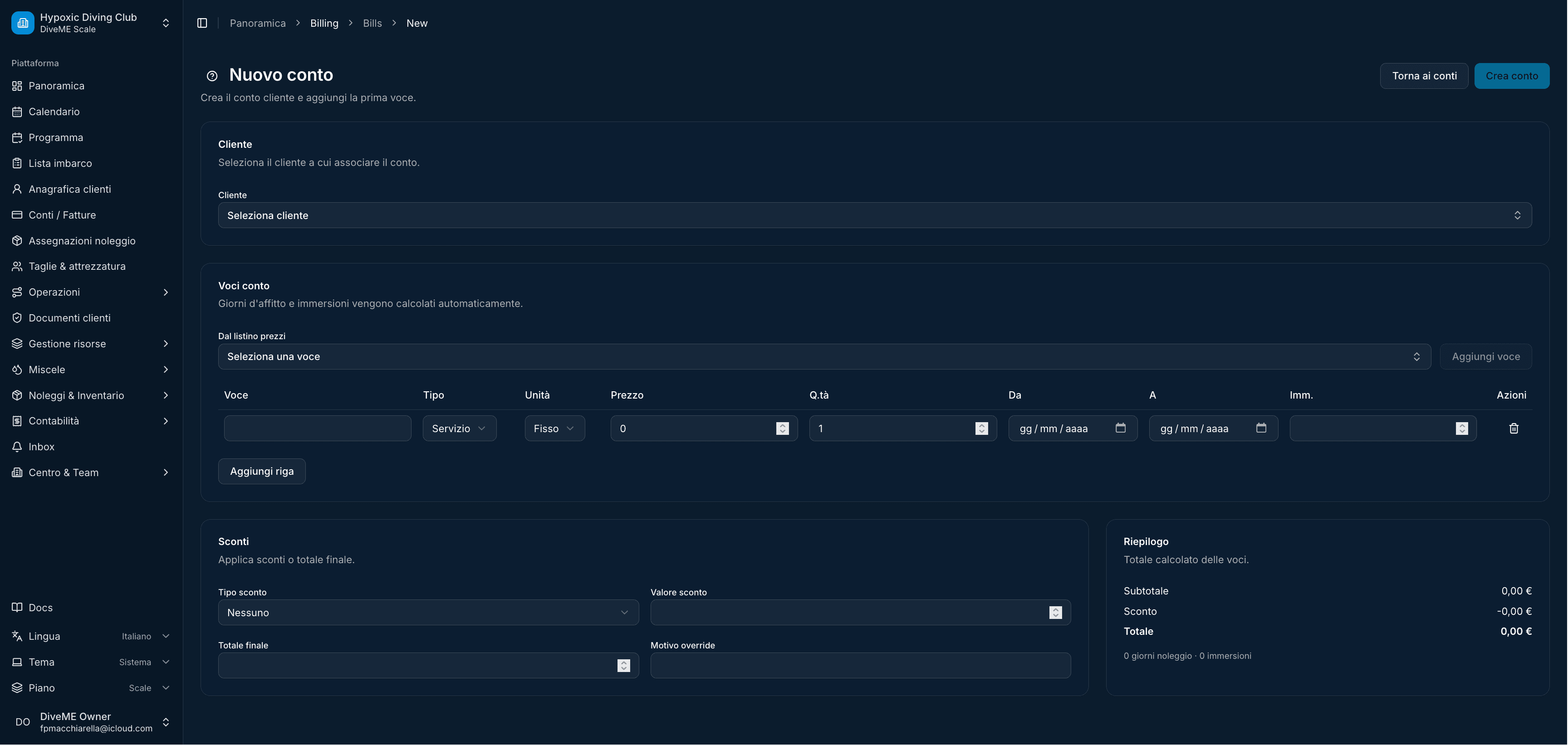
What it shows: New account/customer workflow with billing, item rows and total summary.

Why I built it this way: I positioned totals and line items together so staff can verify payment implications while entering the order.

Scope: Customer/order creation, billing rows, totals, rental or service selection and checkout preparation.

Checkout
DiveME Checkout screenshot
Product screen 5Pay

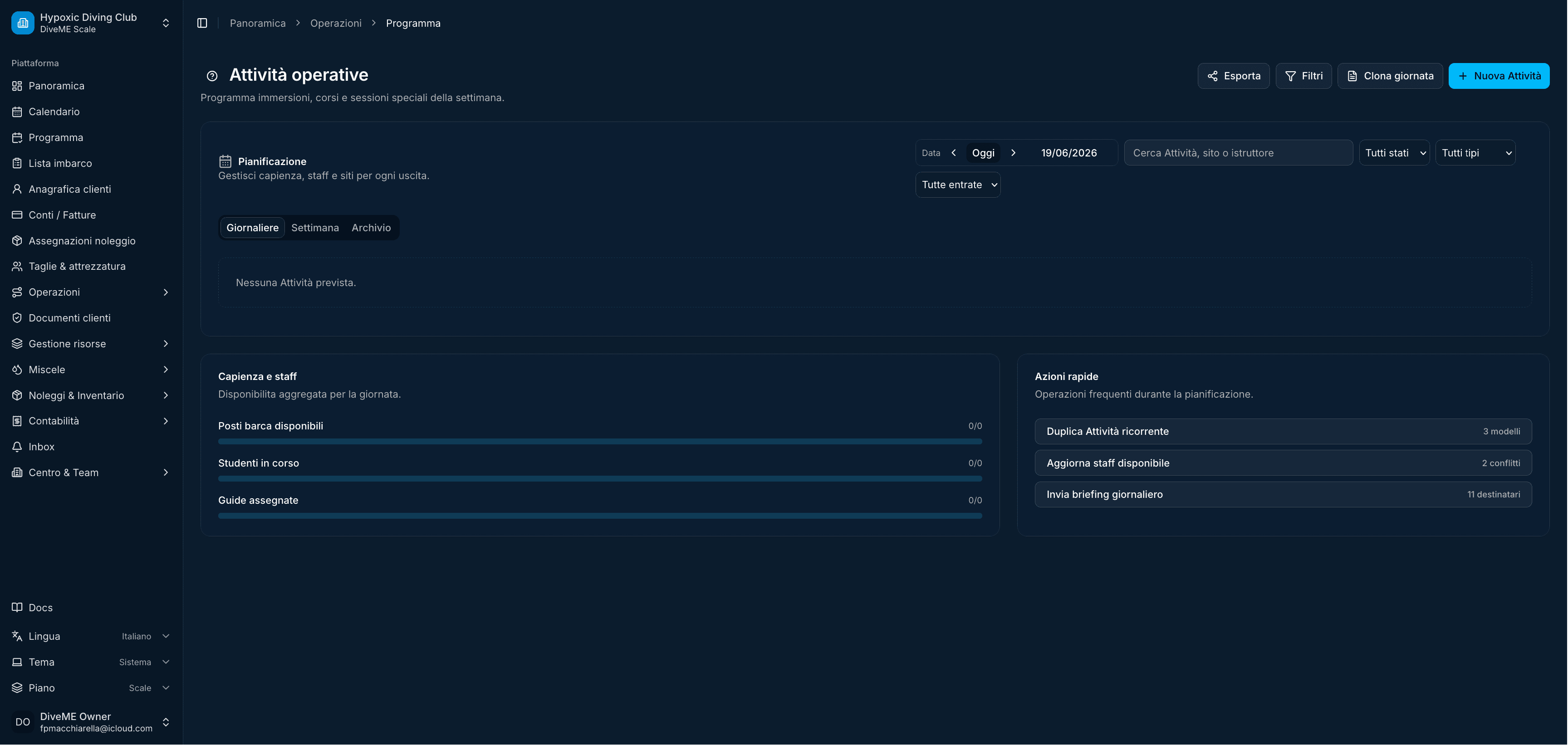
What it shows: Operational activity page with participants, activity rows, filters and related side actions.

Why I built it this way: I structured it around the activity because diving-center work is scheduled around events, people and equipment readiness.

Scope: Activity operations, participants, filters, assignment state and staff coordination.

Courses
DiveME Courses screenshot
Product screen 6Dive

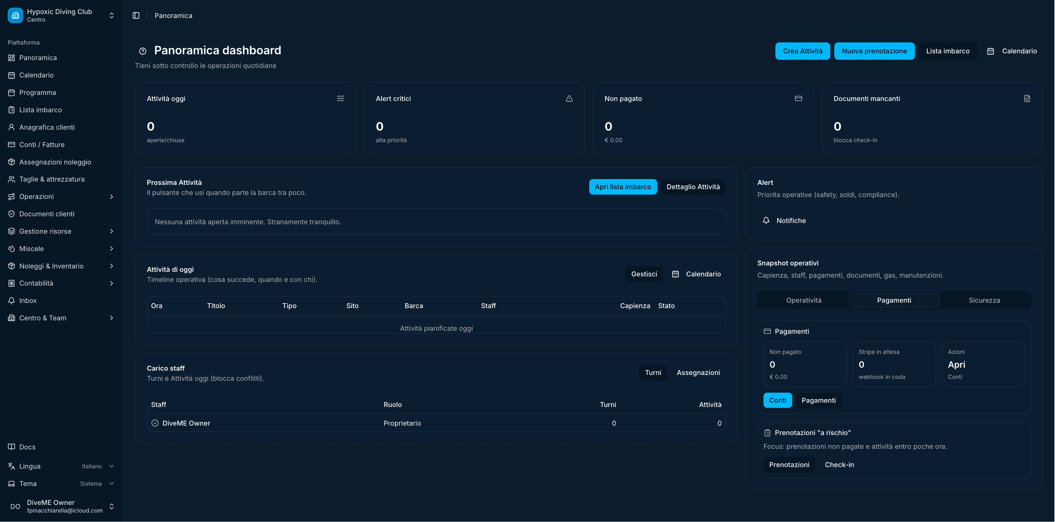
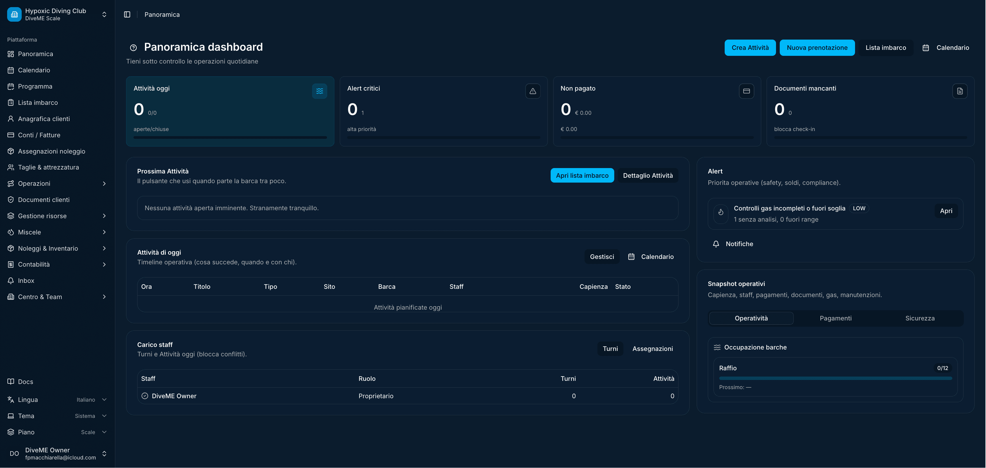
What it shows: Panoramic dashboard with counters, open items, activity lists and grouped operational widgets.

Why I built it this way: I gave staff a single control room view so they can see bookings, customers, payments and tasks before choosing a module.

Scope: Main dashboard, KPI cards, operational lists, payment widgets and quick navigation.

Mobile
DiveME Mobile screenshot
Product screen 7RN

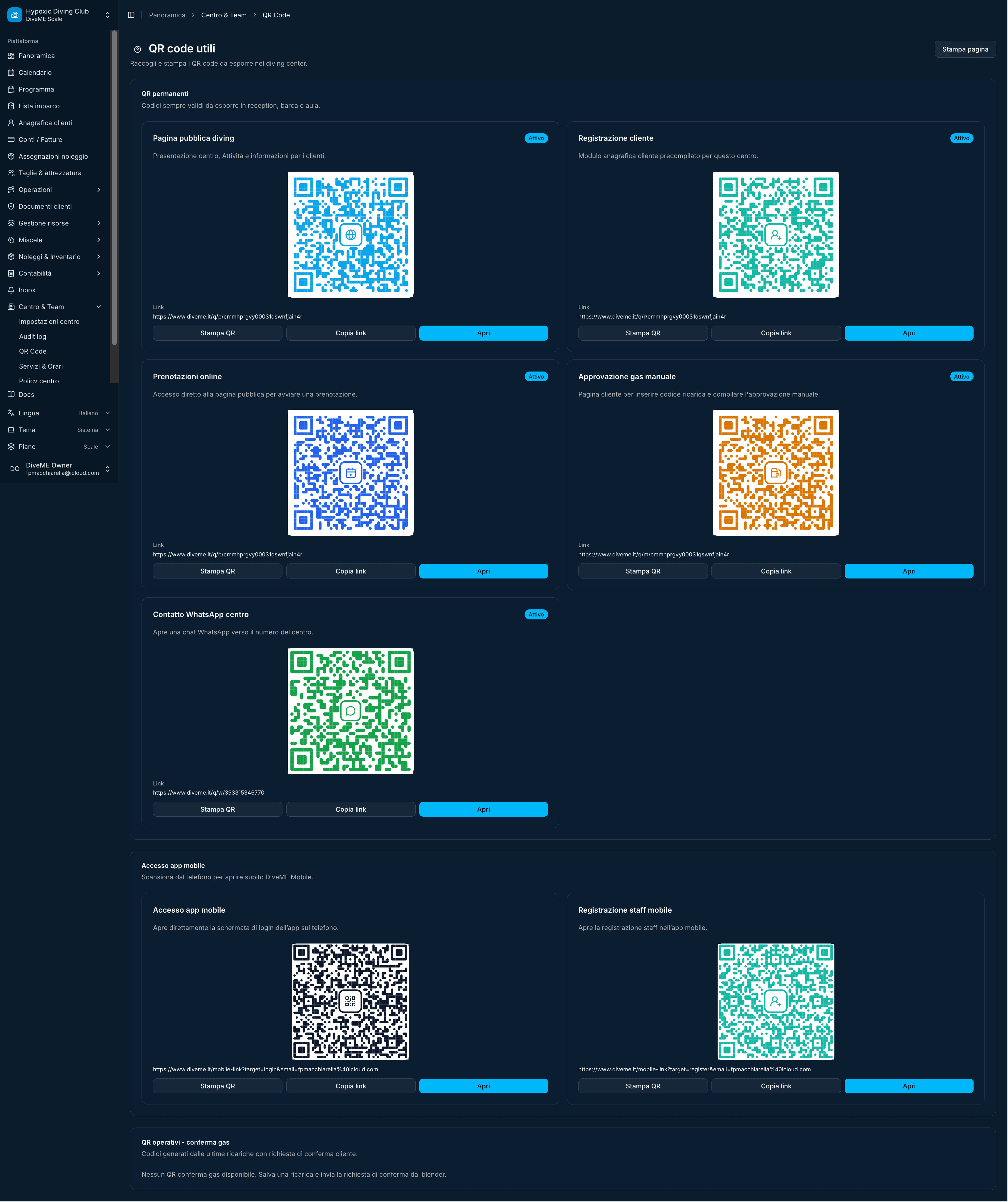
What it shows: QR-code management screen with multiple generated codes grouped by use case.

Why I built it this way: I made QR cards visually distinct because staff may need to print, share or identify codes quickly during daily operations.

Scope: QR generation, access/check-in flows, code grouping, staff tools and shareable operational assets.

Admin
DiveME Admin screenshot
Product screen 8Staff

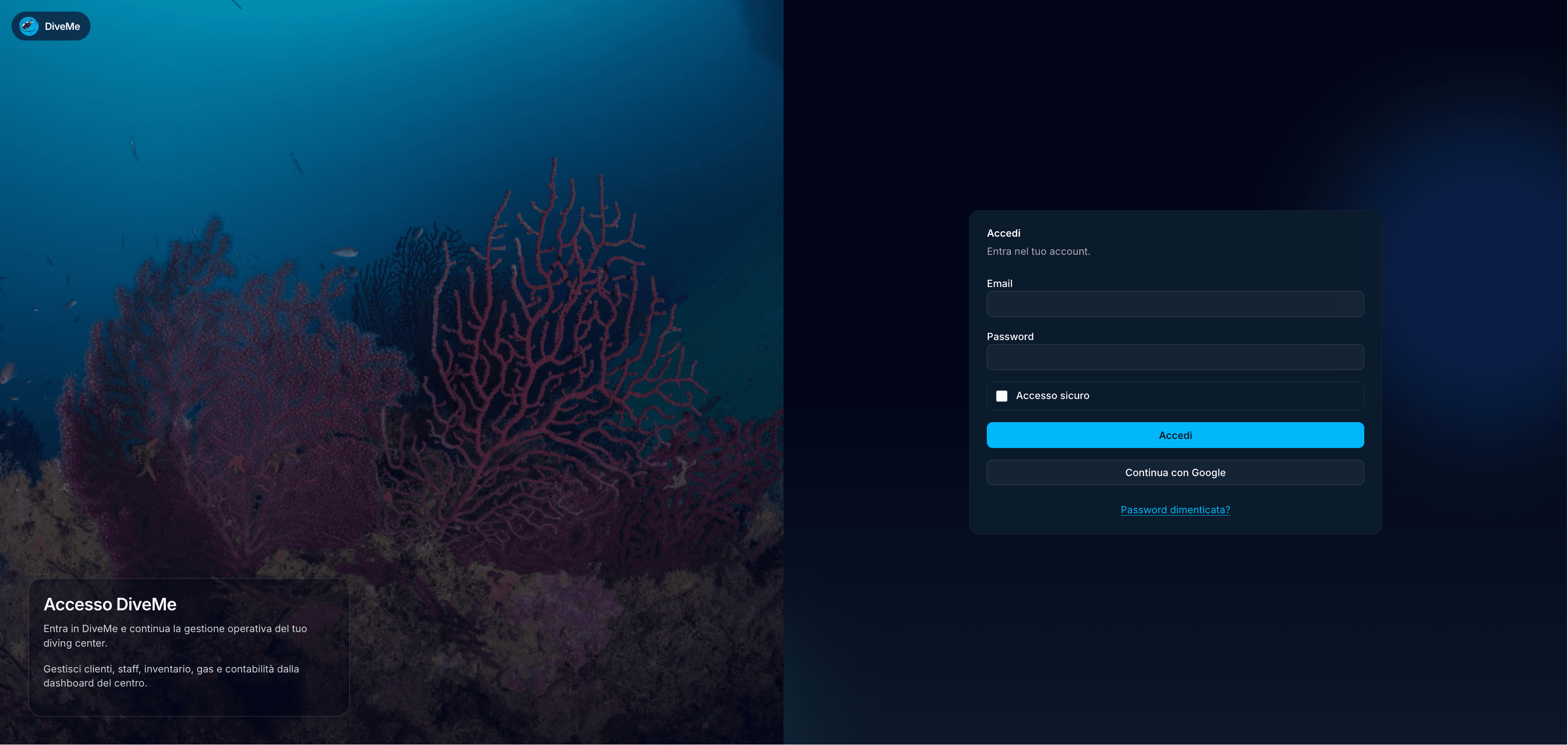
What it shows: Login page with underwater visual identity, authentication panel and external sign-in option.

Why I built it this way: I used a strong domain image to make the product immediately recognizable while keeping the access form focused and minimal.

Scope: Authentication, brand entry, login UX, provider sign-in and secure product access.